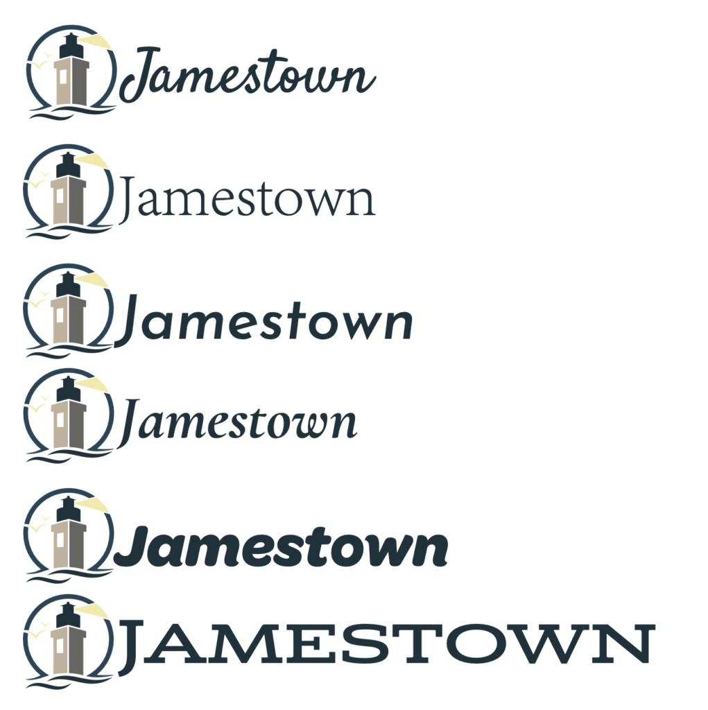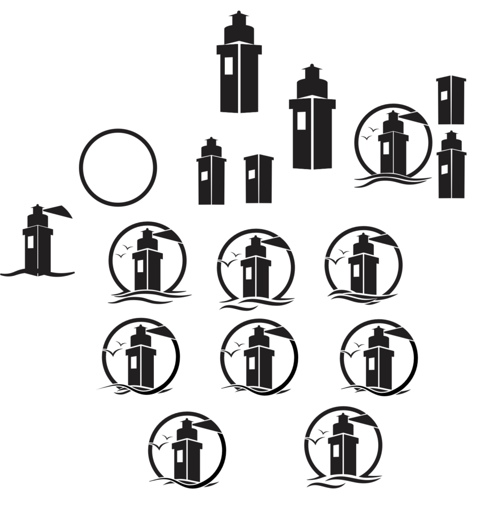
Jamestown Logo
I created this logo for Jamestown with the Beavertail Lighthouse in mind. A lighthouse is a perfect symbol for an island town. Plus this lighthouse doesn’t look like every other lighthouse.
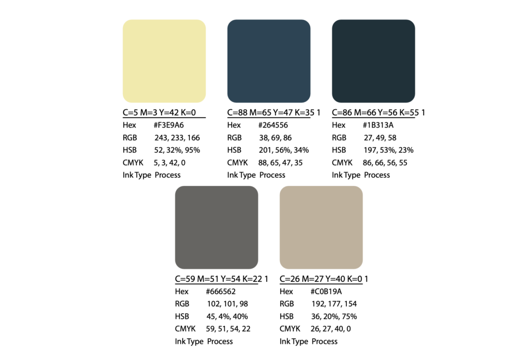
I added two birds and waves because Jamestown is an island. I found an image of the lighthouse and sampled the dark blue from the water. I used that blue for the color of the word, the waves, and the top of the lighthouse. Then I sampled a slightly lighter blue from the water and made the circular border that shade of blue. The greyish beige colors I used for the base of the lighthouse was sampled from the actual base of the lighthouse in the image. Lastly, I knew I wanted the ray of light yellow, and I thought the birds could be seagulls. However, I wanted them the same color so I went somewhere in the middle and made them both light yellow. It took me a long time to get the waves just right, as well as the font. The font is “Satisfy Regular”.
Logo Swatches
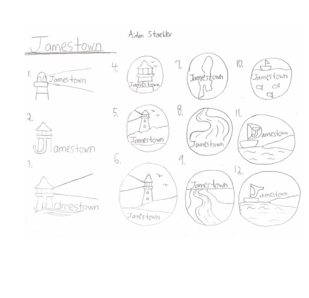
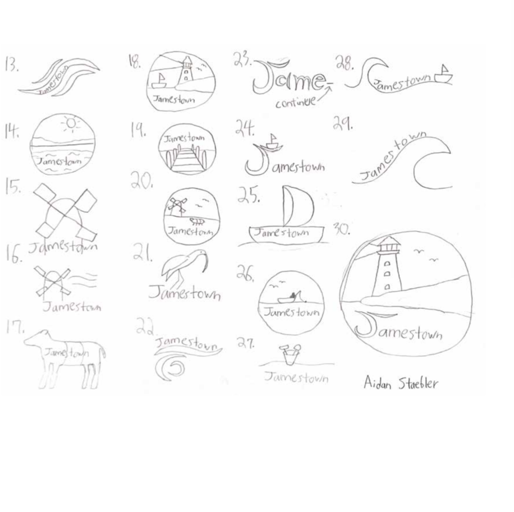
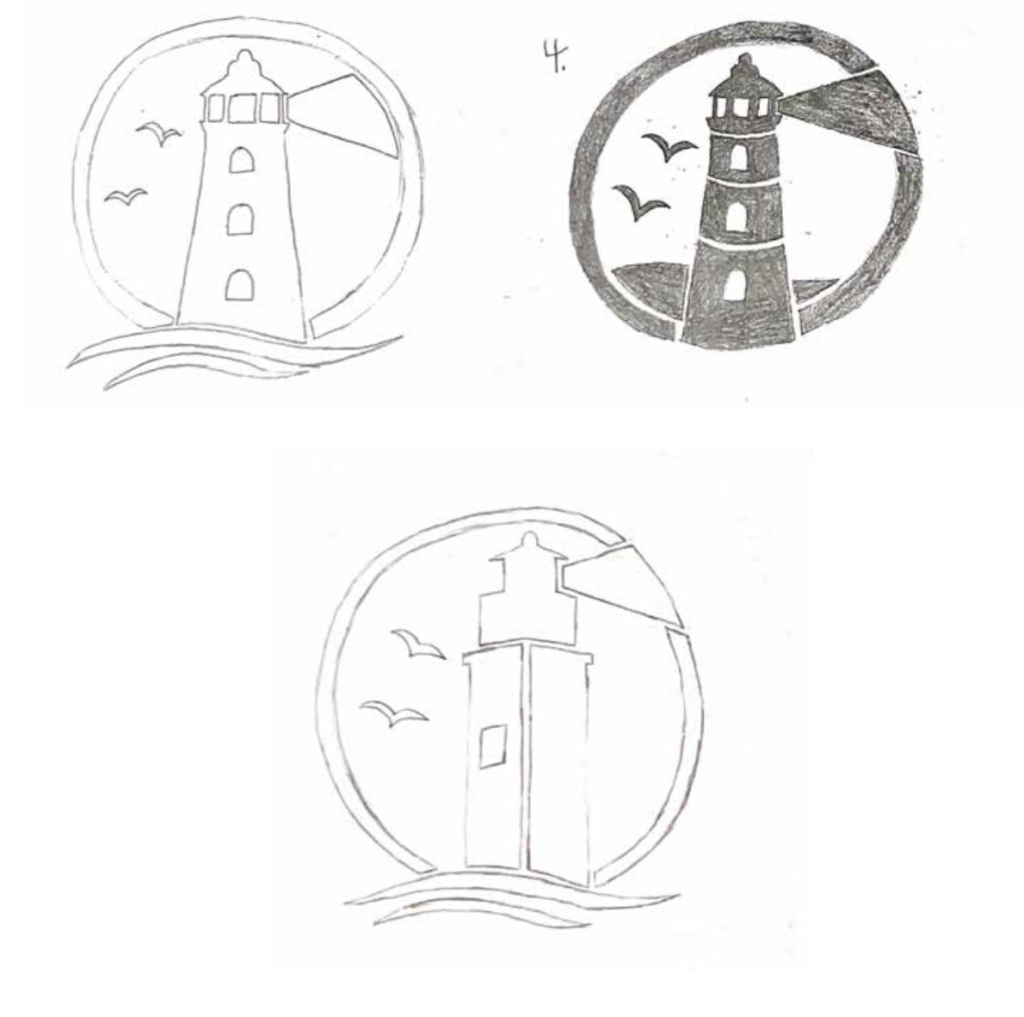
My Process